Project 9 Portfolio

    • Portfolio (Scribd.com):
    • Project Corrections / Time spent: I fixed my Montage project and spent a total of 3 hours trying to brainstorm, plan, and execute the new project.
    • Message: In this portfolio I wanted to showcase my projects from this past semester. I wanted this outline of this portfolio to be very simple, sophisticated, and easy to understand. I wanted the main focus to be on all my projects.
    • Audience: The audience of this portfolio includes friends, family, and most importantly potential employers.
    • Top Thing Learned: I think the most important thing I learned in this project is how to use and apply master pages for creating a project that has multiple pages.
    • Future application of Visual Media: In the future I will continue to learn, apply the skills I have already learned, and try new prjects with InDesign, Illustrator, and Photoshop because I loved getting to learn about them through this class.
    • Color scheme and color names: Black and white
    • Title Font Name & Category: Helvetica Thin
    • Copy Font Name & Category: Helvetica Thin


Project 8 Brochure

  1. P8-AlyssaChandler-inside
    Inside of Tri-fold Brochure
    P8-AlyssaChandler-back
    Back of Tri-fold brochure


    1.Description: This is a Brochure for a Charity Art Auction held by “Art Works”. All of the proceeds go to a charity of choice as explained in the brochure.

  2. Process (Programs, Tools, Skills): I used Adobe Illustrator to create the simple logo on the back. I then used Adobe InDesign to create the Brochure. I had to plan everything out before I started working in InDesign to make sure I had the right set up. After the many drafts I inserted the images and lowered the opacity. I added all the details and tried my best to tie everything together.
  3. Message: The message this brochure is supposed to relay is all the details for the charity art auction. By donating to the cause the participants will be brightening their life in 2 ways. They will be buying a piece of artwork in which they could display and brighten their ordinary life, as well as helping a child in need. The children that they help will have brighter lives as well.
  4. Audience: People involved in art and community outreach.
  5. Top Thing Learned: I learned the concept of how to arrange different things on a 2D computer sceen, to fold and make a 3D brochure.
  6. Title Font Name & Category: Noteworthy, decorative script
  7. Copy Font Name & Category: Times New Roman, oldstyle 
  8. Word Count of copy: 307

Project 7 Web Page

P7AlyssaChandlerScreenshot

  1. Description:This is the website I created for “Alyssa’s Piano House”
  2. Process (Programs, Tools, Skills): I used illustrator to create the logo, and Text Wrangler to create the HTML and CSS for this site.
  3. Message: The message of this website is for the people looking for piano lessons to see what “Alyssa’s Piano House” is all about.
  4. Audience: Piano students, and Parents
  5. Top Thing Learned: I learned how to successfully use HTML and CSS to make a website
  6. Color scheme and color hex(s): I used black, white, and burgundy.
  7. Title Font Families & Category: Old style- Times New Roman
  8. Changes made to the CSS: I inserted a background image, centered the logo, changed the font and colors, and change the way the link to my blog looks.

Project 6 Stationary

p6letterheadp6Alyssa.Chandler (1)

  1. Description: This is a business card and letterhead for a piano school named “Alyssa’s Piano House”.
  2. Process (Programs, Tools, Skills): I used Adobe Illustrator to create both the letterhead, logo, and the business card.
  3. Message: The message I was trying to show through the logo was the fact that it is a house full of piano students and music. I tried portraying this by making part of the house piano keys. Since my first name starts with an “A” I also incorporated that into the roof of the house.
  4. Audience: Piano students and parents.
  5. Top Thing Learned: I learned how to manipulate shapes and use both the shape building tools and the pathway tool in illustrator.
  6. Color scheme and color names: Red, white, black.
  7. Title Font Name & Category: letterhead- PT sans  Logo-Sinhala MN

Project 5 Logos

AlyssaChandlerP5logos-1

  1. Description: This is a logo for an event App. The purpose of the app is to enable the community to see all the events happening around them. Businesses can post events that they are holding, and app users can also post events to the app. The idea of the app is convenience and speed. The logo is supposed to represent a lightning bolt as well as the letter”Z” for Zanga.
  2. Process (Programs, Tools, Skills): To make this logo I started out with the line tool I made the “Z” shape that I wanted to double as lightning. I then filled the shape with light orange. I made a solid black square and put that in the background. I then added the white font over the image to finish off the logo.
  3. Message: The message this logo is supposed to share is that “Zanga” is a fast and easy event application to use.
  4. Audience: All app users. Mostly young adults.
  5. Top Thing Learned: I learned how to apply all the skills I learned in Adobe Illustrator to make a logo.
  6. Color Scheme and Color Names: F6B172 – light orange, black, and white.
  7. Title / Body Font Names & Categories: 1st font- Myriad Pro  2nd font-Orator std

Project 4 Montage

p4alyssachandler

Description: This is a montage of two different mirror pictures, trying to symbolize self-worth.

Process (Programs, Tools, Skills, Steps taken while designing): I used photoshop to create this project. I used a mask to put the picture on the left over the original mirrored image. I used a black and white filter on the left to create a more distressed feel on that side of the mirror. I wanted the two sides of the mirror to have a clear contrast.

Message: The message I was trying to portray through this photo came from a conference talk given by President Uchtdorf. He told the story of the Ugly duckling, and how we may also feel like an ugly duckling at times. I think it is important to remember our divine potential as children of God, and that is why there is a girl looking in the mirror at herself. She is looking at her divine potential.

Audience: Girls of all ages

Top Thing Learned: I learned how to use and apply masks in photoshop.

Filter / Colorization used and where it was applied: I used a black and white filter on the left side of the picture.

Color scheme and color names: Neutral color scheme, black, white, gunmetal grey, brown.

Title Font Name & Category: Myriad Pro Regular: San serif


Project 3 Photo Design

p3-AlyssaChandler

  1. Description: Photograph of Beats by Dr. Dre headphones, endorsing quality headphones, and listening to music.
  2. Process (Programs, Tools, Skills, FOCUS principles): I created this in Photoshop, and took the picture on the outskirts of Rexburg, ID. One of the FOCUS principles I incorporated was alignment. I wanted all the font to be right aligned in order for the eyes to follow the text clearly and easily. Another principle I used was color. I used a monochromatic color scheme and used indigo throughout the picture (sound waves, logo, and font).
  3. Message: The message I was trying to portray was the positive effect listening to music with quality head phones can have on your life. Music is so powerful so, why leave out your life’s background music?
  4. Audience: Young adults/ Music Lovers
  5. Top Thing Learned: How to create layers in Photoshop.
  6. Color scheme and color names: Indigo, black, white.
  7. Title Font Name & Category: Helvetica Sans Serif
  8. Copy Font Name & Category: Helvetica Sans Serif
  9. Thumbnail of original, unedited image inserted: 
  10. Date and location you took the photo(s): 2/4/15 Taken on the outskirts of Rexburg.

Project 2 Event Ad

P2alyssachandler

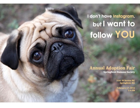
  1. Description: This is an Ad I created for the Annual Adoption Fair held by the Humane Society
  2. Process (Programs, Tools, Skills, FOCUS principles): I created this Ad in Microsoft word, and found/scanned the background image from a magazine in the library. One of the FOCUS principles I used was alignment. I decided to right align all the text in the Ad in order to put more emphasis on the image on the left. Another principle I used was color. The color of the font is white, and a shade of orange that is found in the background of the image.
  3. Message: The message I was trying to get across was the amount of loving pets that are in need of homes. The Humane Society has an event every year, to help increase the amount of pet adoptions.
  4. Audience: The target audience is young adults or teens (or other people who use Instagram)
  5. Color scheme and color names: The colors I used for the font are white, and a light orange that I was able to apply using the dropper tool in Microsoft Word.
  6. Top Thing Learned: The top thing I learned through this project was how to properly scan an image, and how to utilize that for an Ad in Microsoft Word.
  7. Title Font Name & Category: Avenir Light- San Serif
  8. Copy Font Name & Category: Times New Roman- Serif
  9. Scanned images used, sources, original sizes, location of scanner used: I scanned the background picture from a Home Improvement magazine I found in the McKay Library, and used the scanners in the Mac Lab.

Project 1 Flier

Alyssa-Chandler-InDesign-Flier

  1. Description: Graduate Leadership Conference flier for Vouant Communications.
  2. Process (Programs, Tools, Skills, FOCUS principles): The Program I used to create this flier was InDesign. One tool I used was the grid which enabled me to align everything. Some skills I learned throughout this activity include the ability to create shapes, and using the fitting attribute on images to fill the content box. The two main FOCUS principles I incorporated in my flier are contrast and alignment. The title “Graduate Leadership Conference” written in white, contrasts with the black background. I left aligned the information, and made sure the logo top and bottom aligned with the paragraph.
  3. Message: Vouant Communications is holding a Leadership Conference for graduate students to improve leadership skills.
  4. Audience: Graduate students
  5. Top Thing Learned: How to create a flier using InDesign
  6. Title Font Name & Category: Times & Serif (Old Style)
  7. Copy Font Name & Category: Source Sans Pro & Sans Serif (square)
  8. Links to images used in this project:  https://byui.brainhoney.com/Frame/Component/CoursePlayer?enrollmentid=45554894